![]()
COLORS
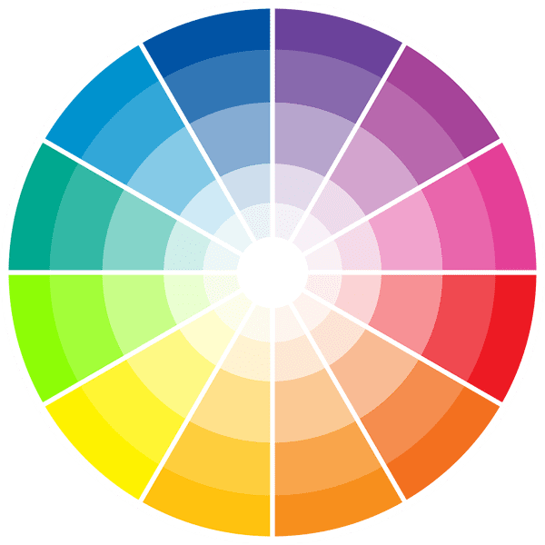
Color Combinations
In addition to understanding color meanings and perceptions, it helps with mixing and matching colors to know the relationship of adjacent, complementary, and clashing colors.
The subject is more fully explained in this Color Basics article from About.com.
Below are samples of the different color styles you can choose for your website. Remember, it’s not about your favorite colors, it’s about appealing to your target audience.
Here’s a great color chart that lets you choose your own color combinations.

Monochromatic
DEFINITION: Single color used in varying shades.
TARGET AUDIENCE: The scheme preferred by the older target audience.
Tints are achieved by adding white, thereby increasing lightness; Shades are achieved by adding black, thereby decreasing lightness; Tones are achieved by adding gray, thereby decreasing colorfulness.
Monochromatic color schemes provide opportunities in art and visual communications design as they allow for a greater range of contrasting tones that can be used to attract attention, create focus and support legibility.
The use of a monochromatic color provides a strong sense of visual cohesion and can help support communication objectives through the use of connotative color. The relative absence of hue contrast can be offset by variations in tone and the addition of texture.
It gives a clean look to a website and is often soothing, pleasing to the eye. It is perceived as calming, especially blue or green hues. However, it can also be perceived a dull and boring by younger visitors.


Complimentary
High contrast colors – Usually using a combination of two shades next to each other on the color wheel and the opposite of one of them.
When you mix warm colors with cool colors you create a pleasing to the eye effect with an energetic target zone. Use the target zone color sparing but to draw the eye to something important or interesting on the site.
Complementary colors can create some striking optical effects. The shadow of an object appears to contain some of the complementary color of the object. For example, the shadow of a red apple will appear to contain a little blue-green. This effect is often copied by painters who want to create more luminous and realistic shadows. If one stares at a color for about 45 seconds, and then looks at a white paper or wall, they will briefly see an afterimage of the object in its complementary color.


Split Complimentary
More nuances then complementary. Retains strong visual contrast but using more subtle combinations. This scheme is a little harder to balance the colors.
Using a single warm color against a range of cool colors puts the emphasis on the warm color and vise versa. Be careful using desaturated warm colors (browns or dull yellows) as it may ruin the scheme.
Split-complementary colors are like complementary colors, except one of the complements is split into two nearby analogous colors. This maintains the tension of complementary colors while simultaneously introducing more visual interest with more variety.
Color harmony has been a topic of extensive study throughout history, but only since the Renaissance and the Scientific Revolution has it seen extensive codification. Artists and designers make use of these harmonies in order to achieve certain moods or aesthetics.


Triadic
High contrast variation of harmonizing colors. Colors may skip two or three zones on the color wheel and are generally not muted. These colors are not recommended for the older target audience.
Triadic colors give an energetic feel to the website. Pick one color as the dominant color or your visitors will get frustrated. Use the most vibrant color as a “hotspot” to draw attention to information.
To find triadic colors on the color wheel, you can visualize or draw an equilateral triangle. The points of the triangle will correspond to the three colors in the triadic scheme. For instance, if you start with orange, the other two colors in the triadic scheme would be green and purple, as you count three spaces clockwise and counterclockwise on the color wheel.
Triadic colors are widely used in various fields such as graphic design, interior design, and art. They create a lively and energetic feel, making them ideal for projects that require a vibrant palette. When using triadic colors, it is often recommended to select one color as the dominant hue and use the other two as accent colors. This approach helps to maintain balance and avoid overwhelming the viewer.


Tetradic – Double Complimentary
Double complementary colors, also known as tetradic colors, consist of four colors arranged into two complementary pairs. This color scheme is derived from the color wheel, where complementary colors are positioned directly opposite each other. For example, if you choose red and green as one pair, your second pair could be blue and orange. This results in a balanced yet dynamic palette that can add depth and excitement to your designs.
This scheme offers more color variety but is also the hardest to balance. Using the Triadic scheme, pick colors that would create a triangle on the color wheel. Use a lighter shade of one of the colors for best results. Pick one color for the dominant color.
Avoid pure colors in equal amounts. This scheme is not well received by your older target audience.
